Lectures & discussions
7.1 Hand lettering
Many students are likely to resist hand lettering at first. It’s a good idea to talk about the reasons for it that we present in this essay to get them on the same page with you. It’s great to open students’ eyes to lettering. It’s usually something that just has never crossed their minds, and after trying it, some students will really take to it, and do lovely things.
Of course, you may not agree with our arguments, either. But regardless of how you feel about it, there are two practical reasons to teach hand lettering. One is that you’ll have a much bigger job teaching students not only how to computer letter, but how to scan, size, and print their art. Hand lettering is a way to simplify the process of getting completed art from students. The other reason is that it’s a hand skill that will feed into improved line quality, carefulness, and ability to handle other layout-related tasks.
7.2 The photocopier
This might be the first time your students have had to wrestle with making a reduced photocopy. No matter how many sheets of paper they waste trying to get it right, it’s really important that you require them to hand the pictureless comic in at the required size. Again, it’s a lesson in professionalism, along with a skill they didn’t even know they needed.
Activities
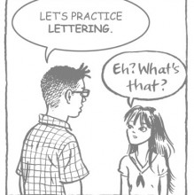
Make lettering guidelines and practice lettering
This is an activity that works well with a demo portion. You can run through the steps yourself first, to show students how it works, or you can have them follow step-by-step as you hold up an Ames guide and draw what they're looking for on the board. In either case, when students are applying the idea themselves, you really must walk around and troubleshoot each step. The whole process is very easy to misunderstand.
Key points:
- Make sure everyone gets the idea of the parentheses. This trick is key for using the right set of lines.
- Make sure everyone makes multiple sets of lines, and understands how you continue laying out lines in either direction.
- Have students practice lettering on their lines so that you can make sure they know where the letters should fall on the lines. You can also troubleshoot here, slowing students down, so they concentrate on the strokes of the letters, and making sure that they leave enough space between letters and words. Emphasize that the process of lettering is UNLIKE writing, and needs attention like drawing does.
A comic with no pictures
Note that most students won't finish this in class. You can assign finishing it for an additional homework, but do start it in class, so students can be corrected again on use of the Ames guide, lettering, and layout issues. It's important here to encourage students to take this activity seriously. It's fun to make a comic where you don't have to worry about pictures, but it can be quite a successful story if the student is willing to think creatively about why they might not be there. It's also crucial that students do their utmost to get the lettering, borders, and effects as cleanly done as possible. This is a big leap forward for many of them, where they've gone through thumbs and pencils, and are finally inking...and correcting. This is the hard bit. Students need to understand that it's fine to mess up, but it's not fine to leave it there and not correct. See section 8.2, pg.116, for more information on corrections.
Sidebar
Making word balloons
You might assign students some phrases to letter for practice, making sure they're laying out the lines carefully, centering, etc. Then you can get them to practice making word balloons around the phrases.
Ruling a straight line: some tools that will help
This chapter is a good place to demo technical pens and graphic white, if nothing else. Students who want to use nib pens for the lettering assignment can be directed to Chapter 8 for more information, or you can demo nibs along with technical pens and ruling pens.
Further reading
Mark Chiarello and Todd Klein, The DC Comics Guide to Coloring and Lettering Comics
J.C. Fink, Maura Cooper, Janet Hoffberg, and Judy Kastin, Speedball Textbook for Pen and Brush Lettering
Ross F. George, Elementary Alphabets
Bill Gray and Paul Shaw, Lettering Tips: For Artists, Graphic Designers, and Calligraphers
Martha Sutherland, Lettering for Architects and Designers
"A month of Sundays" penciling and lettering
Having done the pictureless comic should put your students in a good place to get this page penciled. Emphasize that you want students to letter before tight pencils. The reason for this is that, especially for novices, estimating the space lettering will take is very difficult, and students may find it interfering with tight-penciled art...and then make compromises instead of erasing and starting over, as they should.
Lettering that speaks for itself
In a class that is too short to accommodate the pictureless comic, this activity can be a fun and productive replacement. Have students work on their own, not showing their classmates, and then you can compare solutions in a quick crit.
Homework critique Chapter 7: "A comic with no pictures"
Part of the value of this crit is having both the original and the reduced photocopy posted, so students can see how their lettering will look to size. This is the first step in getting students to think in terms of reproduction, a topic we'll return to often. If students have not made corrections or just need more help, have them correct their work in class after reviewing 8.2, "Making corrections." Be a stickler on letterforms, and the various issues on page 89, with the caveat that some students will take to this much more easily than others. Click on the links below to see examples of the homework by students with some comments from Matt and Jessica.